How to Fit the FreeBSD Logo in a Perfect Circle
The FreeBSD and Apple logos are quite similar.
Both have a heavy base and leaves / tails on top.
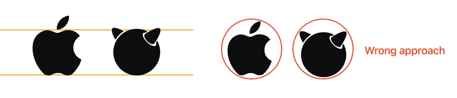
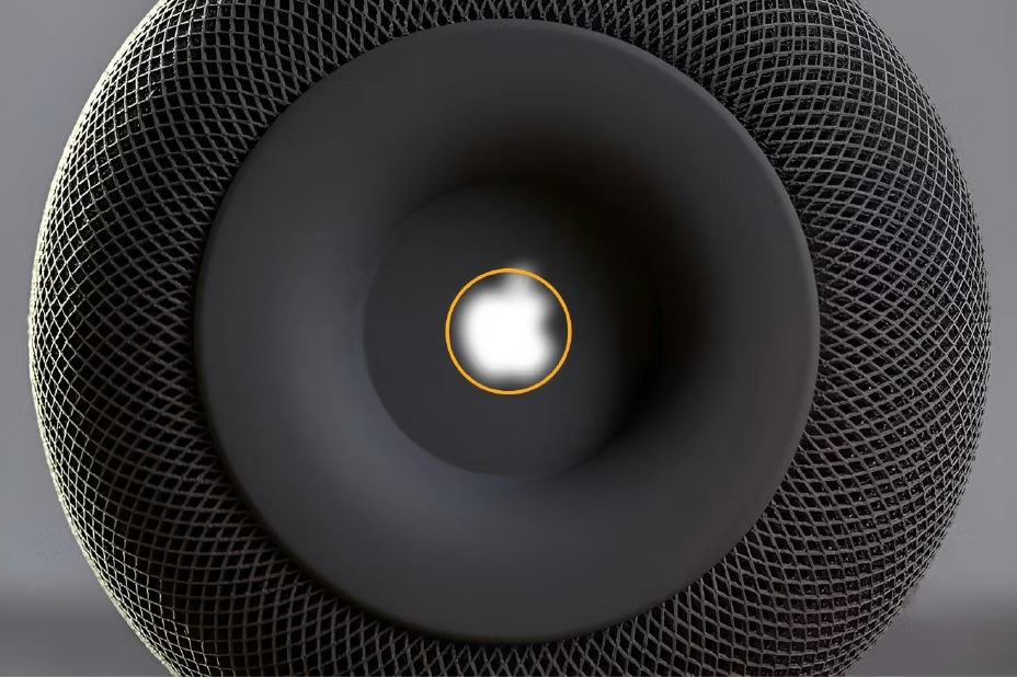
This is how Apple fits its logo into a circle
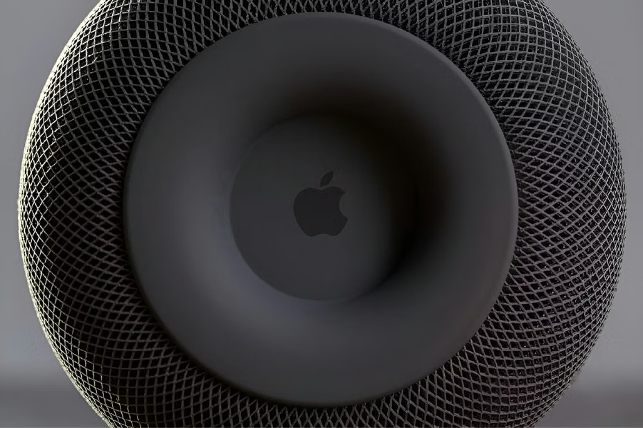
With guides:
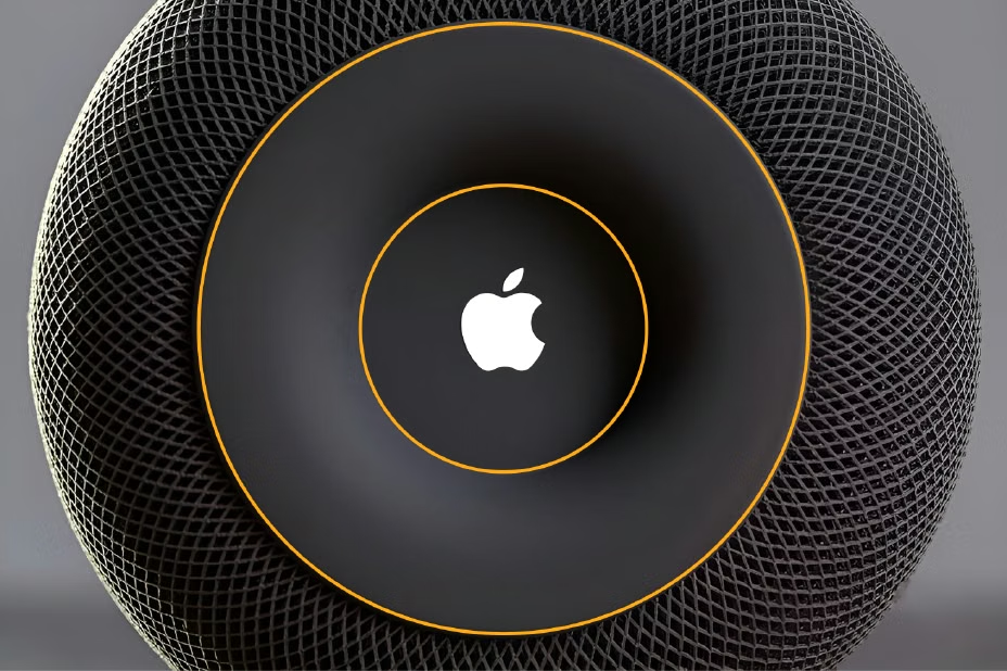
Apple tries to keep heavy center closer to the center of the surface:
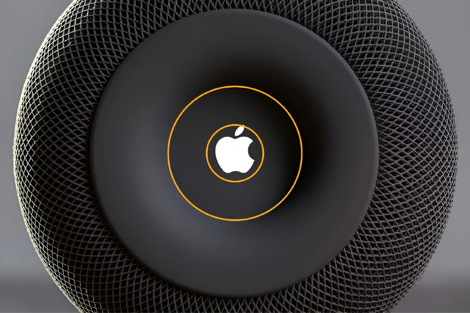
So the mass aligned to the center:
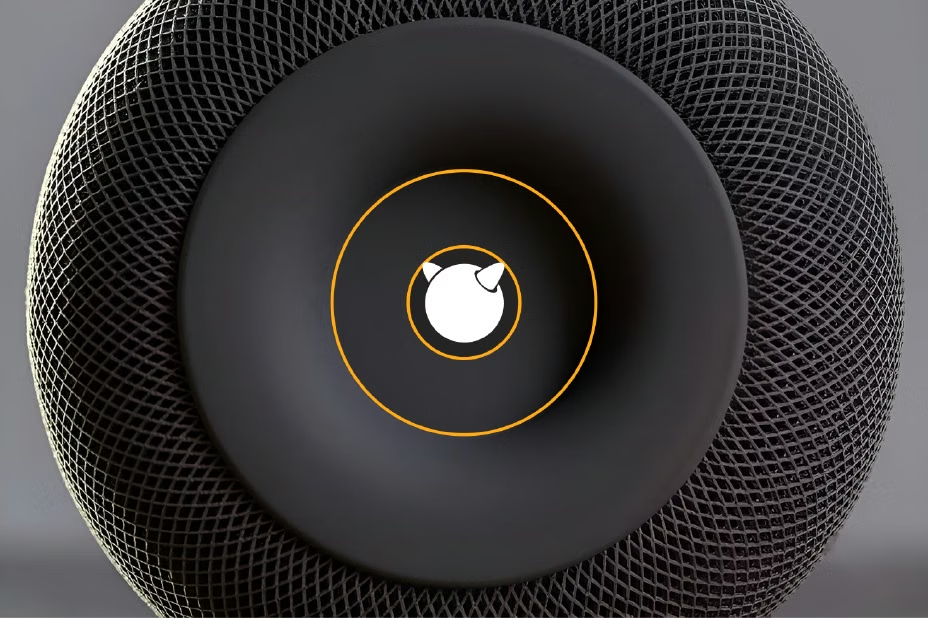
We can apply that same logic to the FreeBSD logo too

For social media